
Jim's Bakery
Brand, Web Design and Packaging

Web Designer
UX/UI Design
Graphic Design
Marketing
Photography
Product Packaging
6 months
Context
Jim's Bakery has been a San Gabriel Valley institution since 1992. Family-owned and operated for over three decades, they're known for Hong Kong bakery classics. Despite their local fame (even featured in Netflix's The Brother's Sun), they had no online presence and minimal brand materials beyond their storefront signage.
The Problem
Jim's Bakery needed to establish a digital presence to reach customers beyond foot traffic. With no existing website, inconsistent branding, and product packaging that didn't reflect their legacy, they were missing opportunities to connect with both longtime fans and new customers. The challenge was creating a cohesive brand identity that honored their 30+ year history while positioning them for growth.


What Did You Do?
I created Jim's Bakery's first digital presence and cohesive brand system, working closely with the family to balance their vision with design best practices. This included building their website from scratch, developing packaging that reflected their heritage, and establishing visual guidelines that could grow with the business.
Constraints
Parameters that shaped the design process
Building The Foundation
What I created
👥 Brand Guidelines
Colours and typography built from existing storefront elements
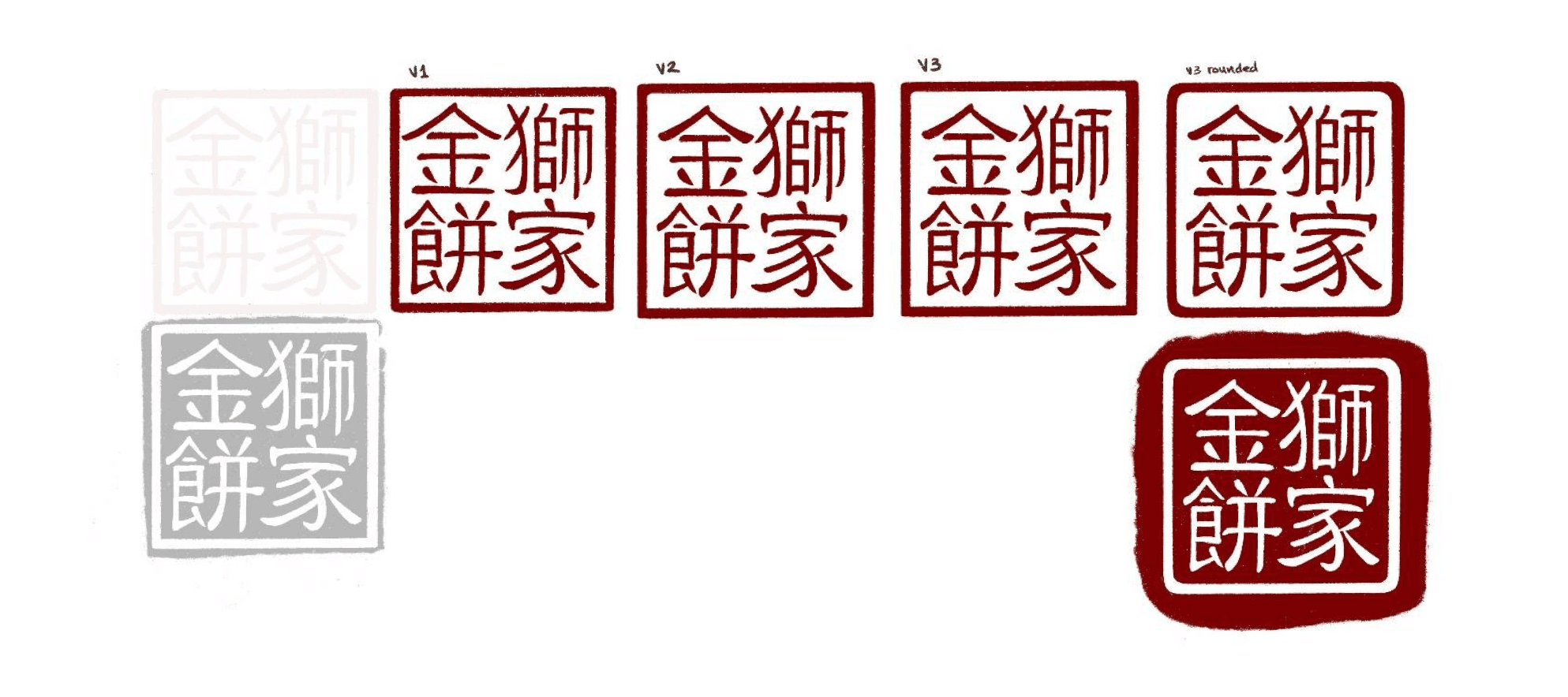
📋 Seal Stamp
Custom Chinese seal stamp for packaging
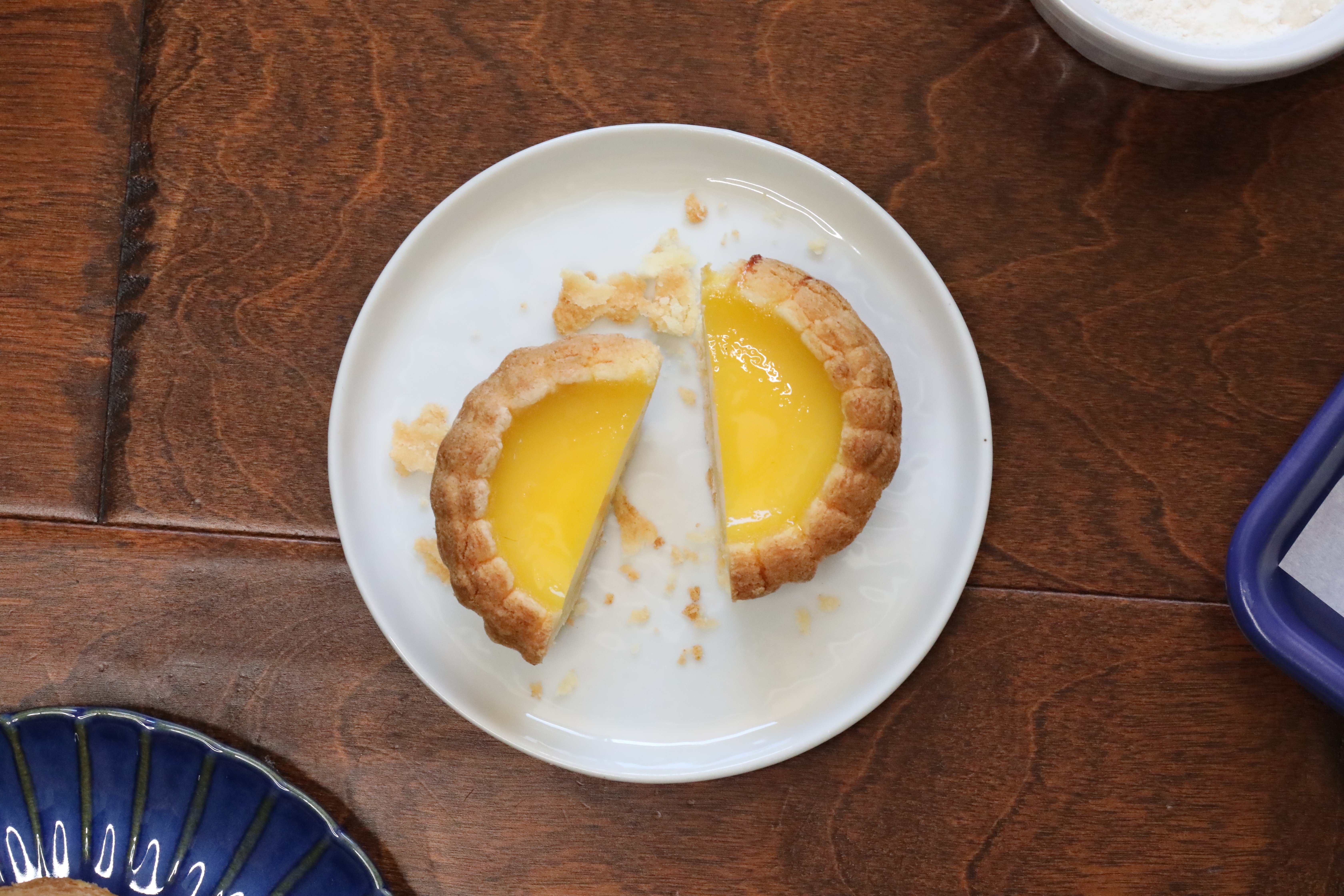
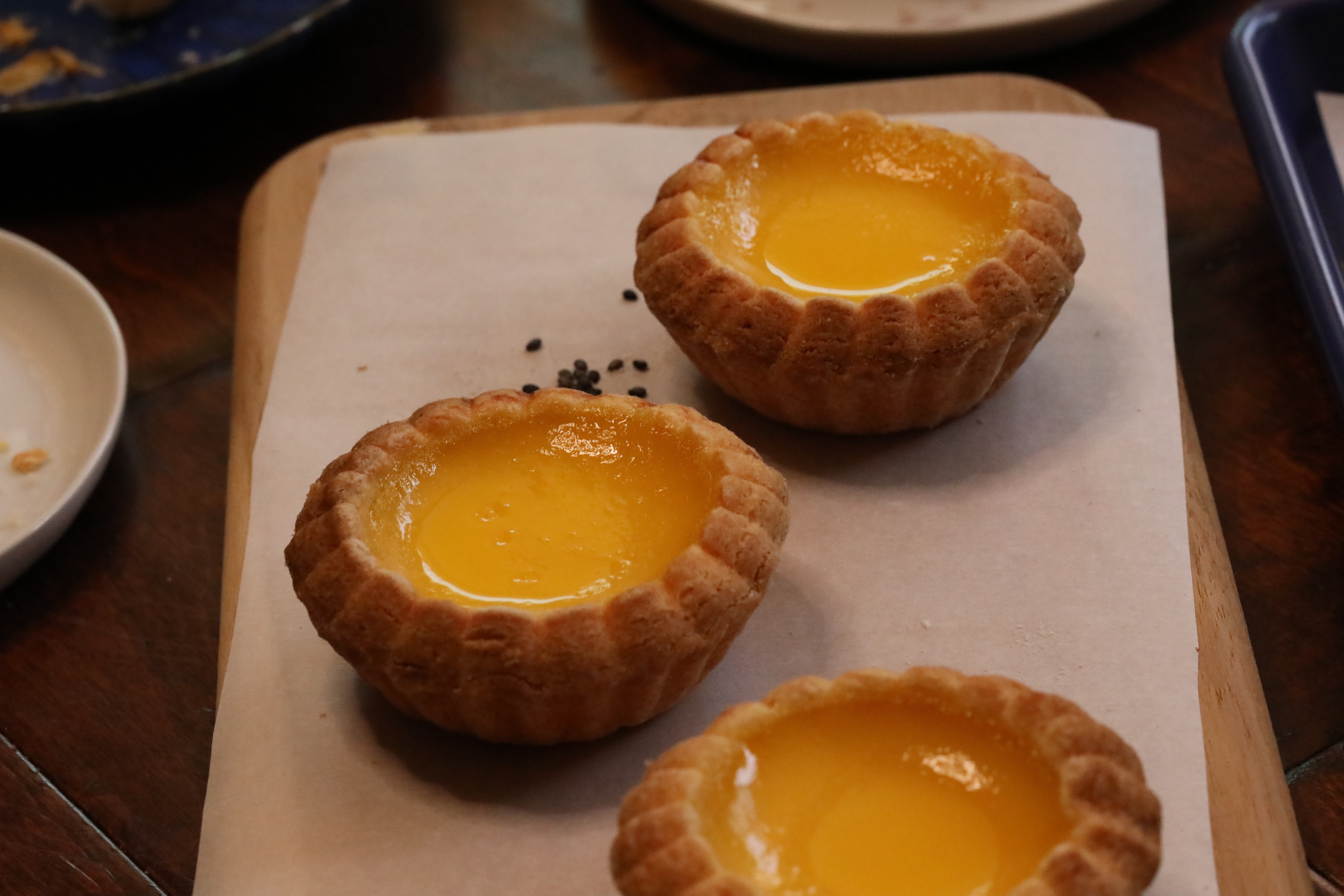
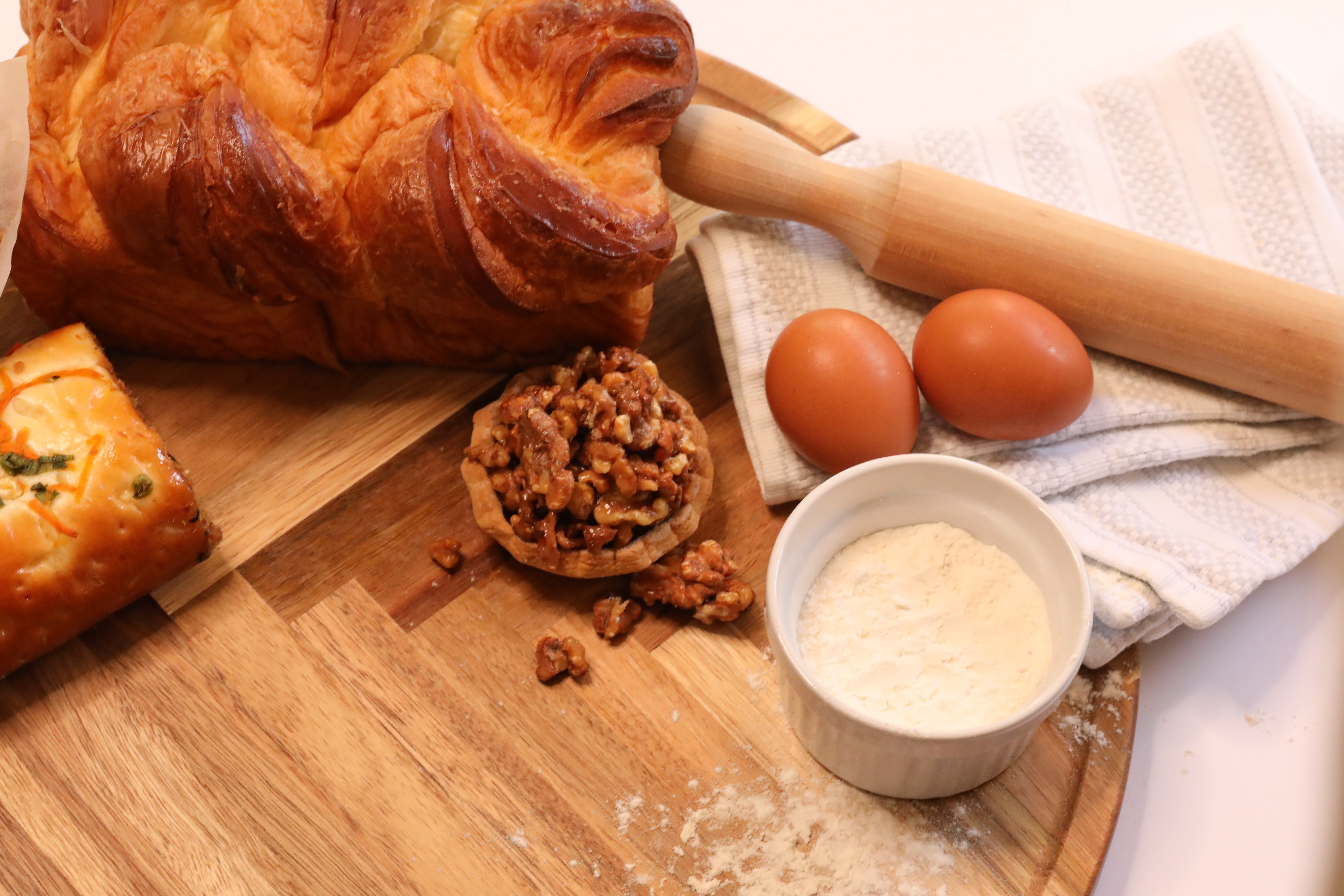
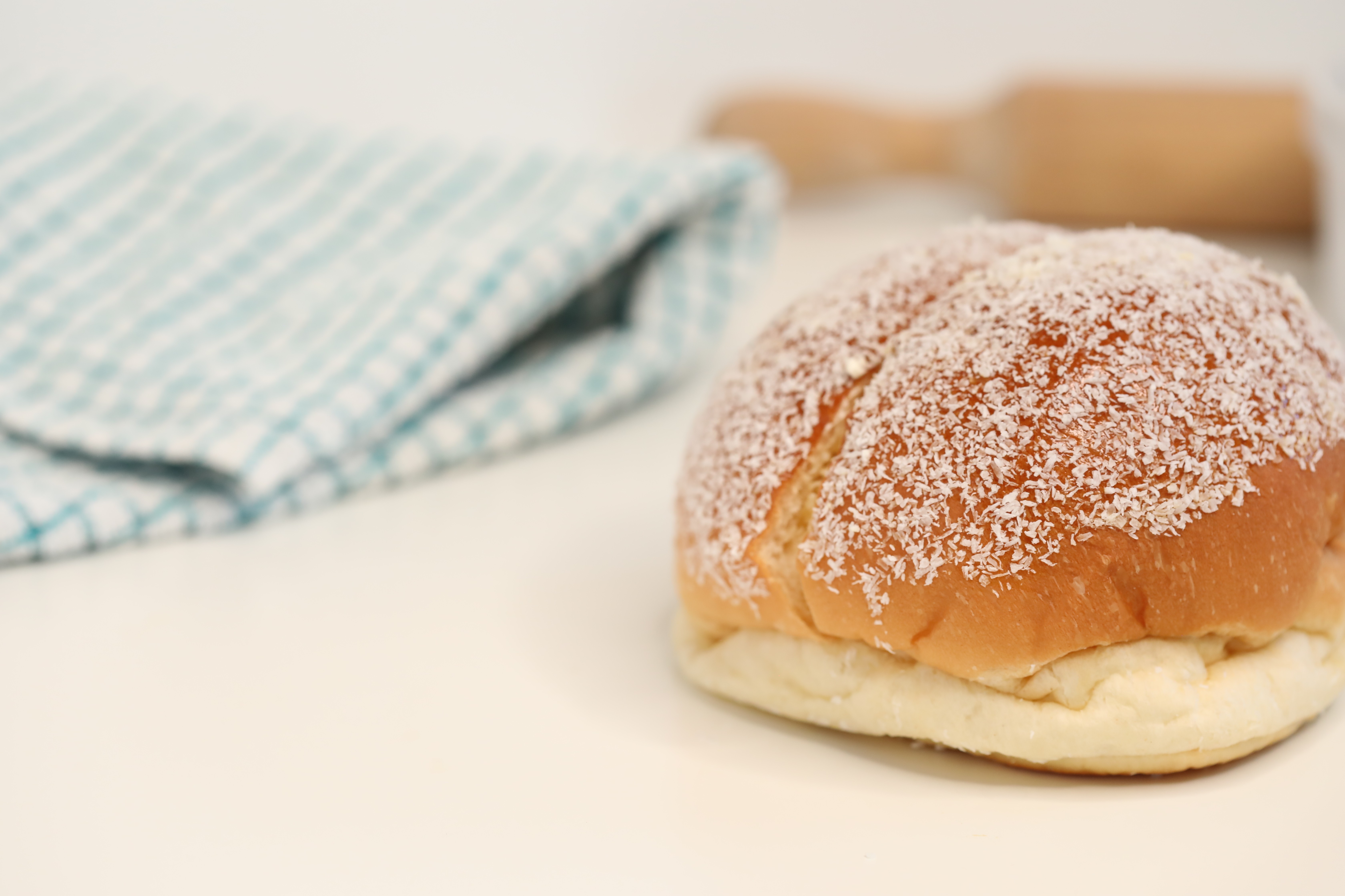
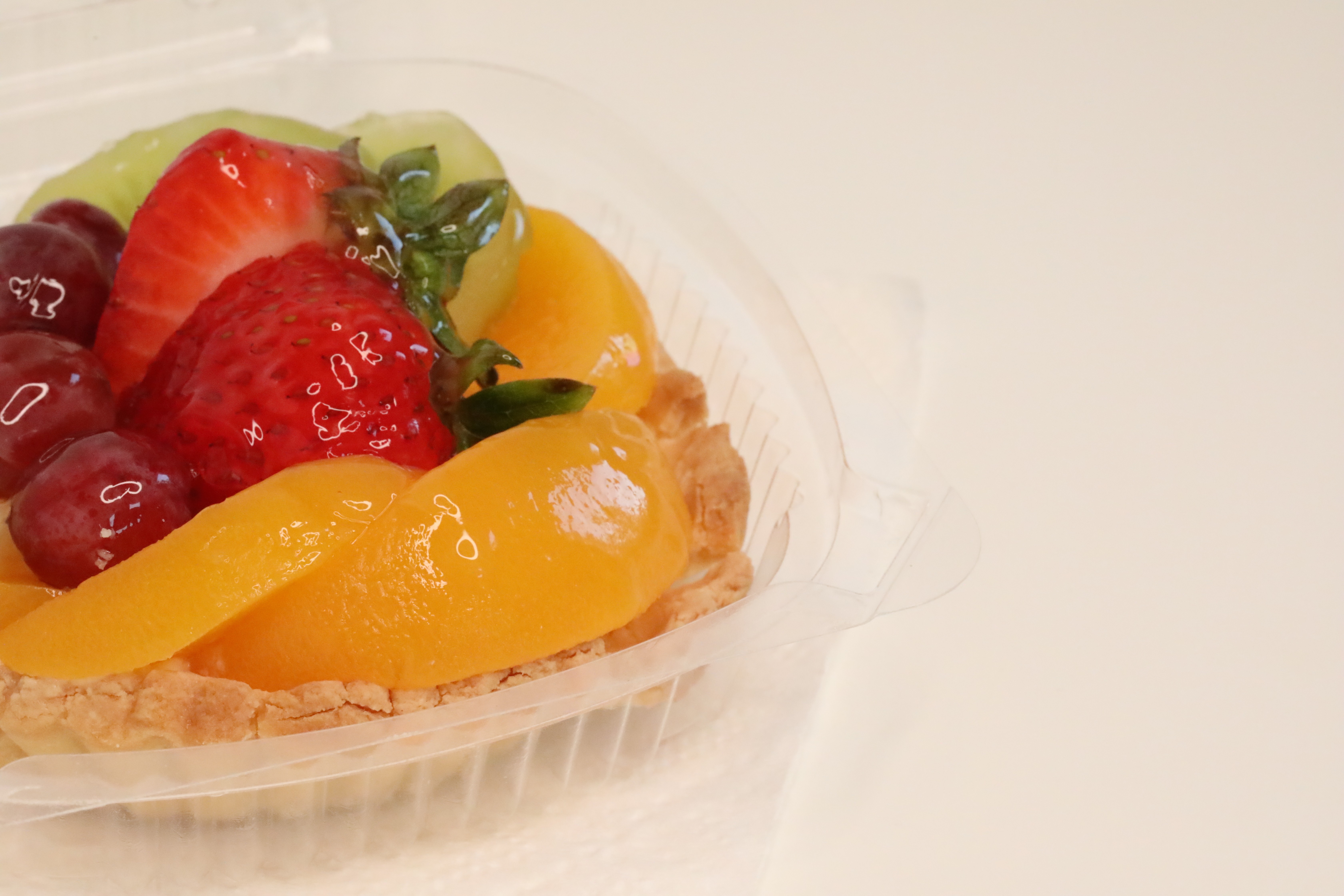
👀 Photography
Photography direction showcasing their handcrafted products
Brand Guidelines
Seal Stamp
The original signage included the Jim's Bakery text logo and '金獅餅家' which means Golden Lion Bakery.

The Idea
What if we transformed the characters into a traditional Chinese seal?
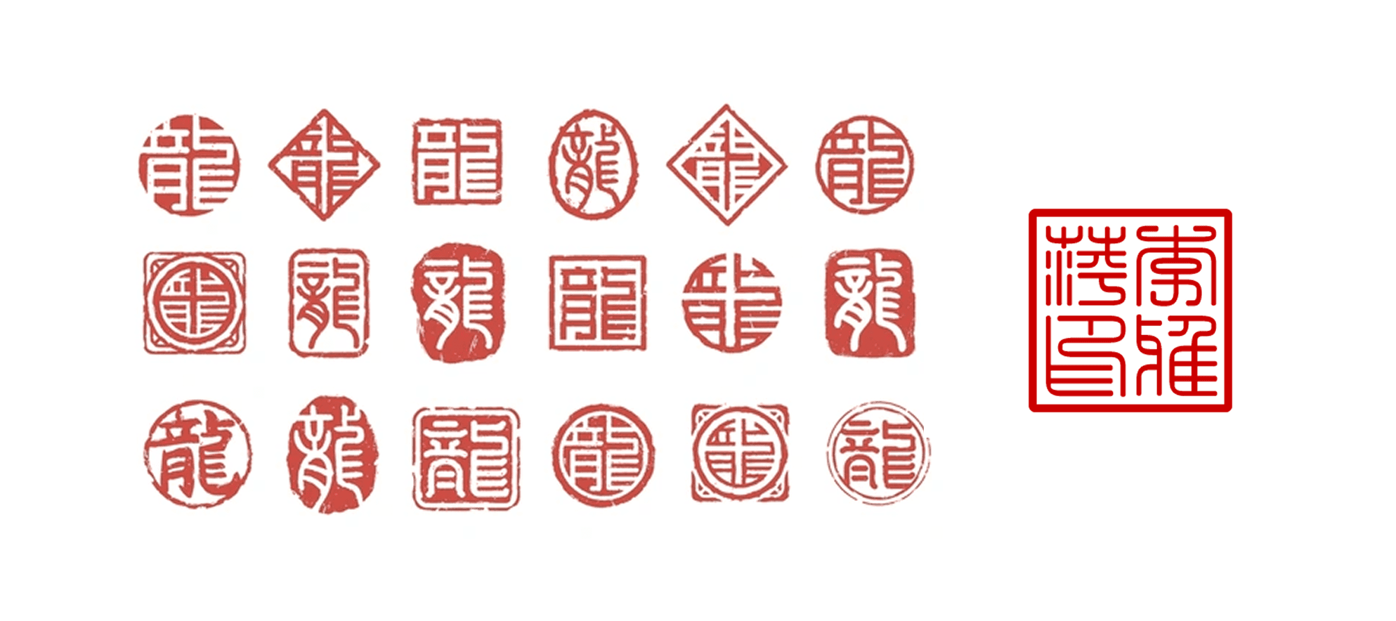
Exploration
I illustrated multiple versions in Procreate, exploring how the characters could work within a traditional seal format.
Photography


Pain Points
#1: Broken Core Functionality
Users struggled with technical bugs that disrupted the browsing experience. A pagination error caused reviews and product tags to disappear when navigating through product collections, making it difficult to evaluate products. Additionally, the filter system lacked visual feedback - when users applied filters, there was no indication of active filters or how they affected the displayed results. This left users confused about what they were actually viewing.

#2: Confusing Information Architecture
The site's navigation was unintuitive and poorly organized.
The blog was labeled "The Root", an ambiguous name that left new users confused about its purpose. The footer navigation was particularly messy, with links grouped under vague categories that weren't clearly distinguished. "Useful Links" and "Support" sections contained overlapping content with no clear logic.

#3: Visual Inconsistencies
Although brand guidelines had been established, not all elements of the website had been updated prior to testing due to time constraints. Users found the visual design lacking cohesion - inconsistent typography, poorly formatted content, and leftover stock imagery created a disjointed experience.

The Website
Key Pages
I designed and built Jim's Bakery's first website on Wix, creating a digital home that welcomed customers and made it easy to discover their offerings.
Landing page: Introducing the bakery's 30+ year story and flagship products
Gallery: Showcasing their Hong Kong bakery classics
Menu: Full product offerings
Contact form: Making it easy for customers to reach them
Design challenge: The owners wanted to include a lengthy, heartfelt description written by the owner's brother on the homepage. While I initially recommended a more concise approach, I learned the importance of compromise - the family's personal touch was part of their authentic story, so we kept it.

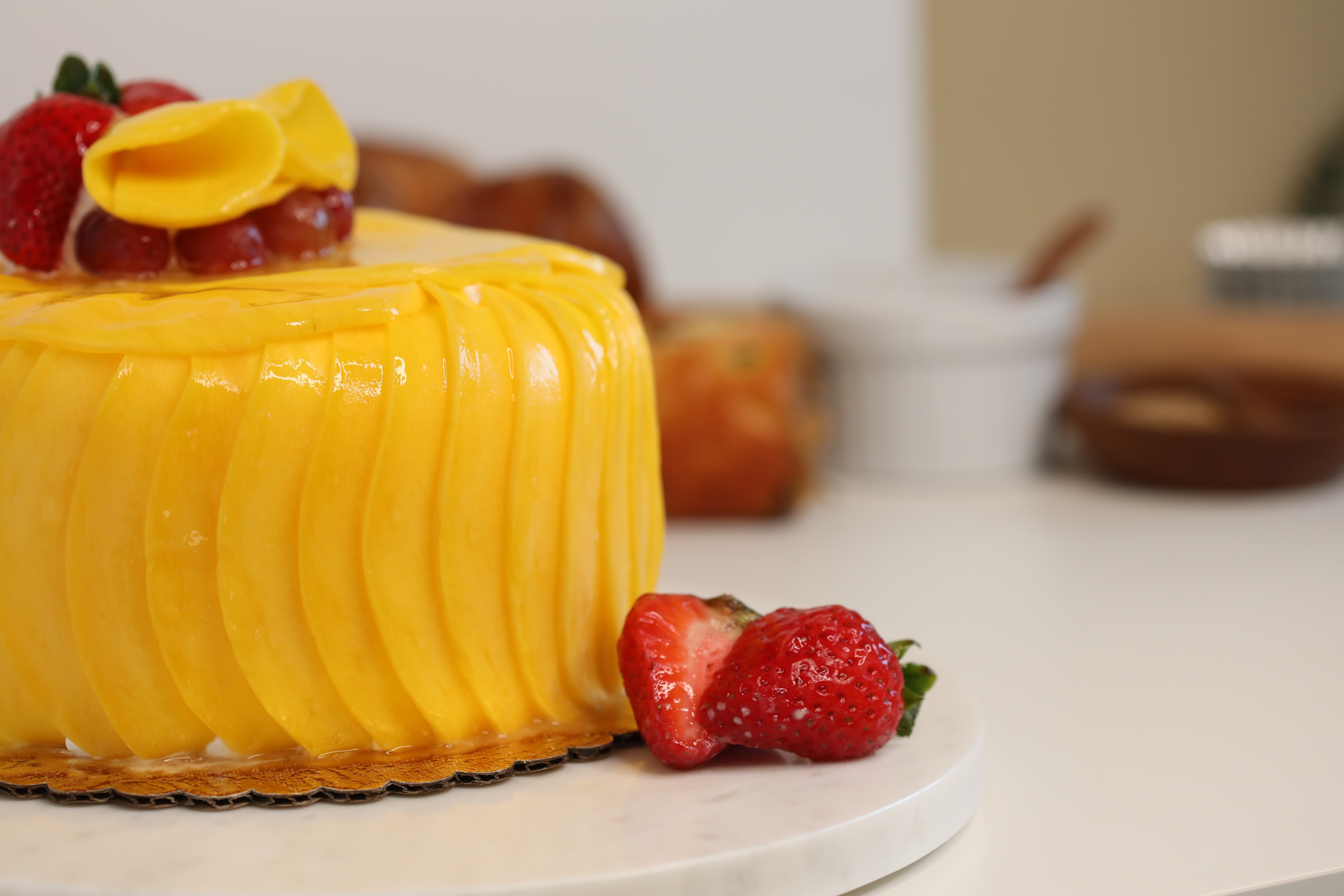
Product Packaging
I designed packaging that elevated Jim's products while honoring their Hong Kong bakery heritage. The custom Chinese seal stamp became a signature element, adding authenticity and craft to every box.
Outcome
Key Pages
Within months of launching, the website directly led to Jim's Bakery being featured on Worth It - a YouTube series with over 10 million subscribers. The Worth It team discovered Jim's through the contact form I designed, validating the power of a thoughtful digital presence.
Client testimonial: "If not for your work, the website wouldn't exist. It's you who put it together, and it's your work that has led to that lead." - Jim's Bakery owner
Impact:
First digital presence for a 30+ year legacy business
Direct lead from Worth It through website contact form
Cohesive brand identity across packaging and digital touchpoints
Foundation for future growth (potential online ordering)
Next steps:
Exploring e-commerce functionality for online orders
Expanding packaging system to additional product lines
Conclusion
This project taught me the value of balancing design expertise with client vision. While I advocated for certain design principles, I learned that sometimes the "imperfect" choices - like keeping the lengthy homepage description - are what make a brand authentic. The Worth It feature proved that a well-executed digital presence, even on a platform like Wix, can open doors for small businesses.